Projects for Equestrian, Coaching, Industrial, Venues, ECE, Medical..

A selection of projects from a range of industries

Website are often maintained by the business owners - the images I share were are the time of build completion


Project Industry & Objective
Please click on the one you would like to explore


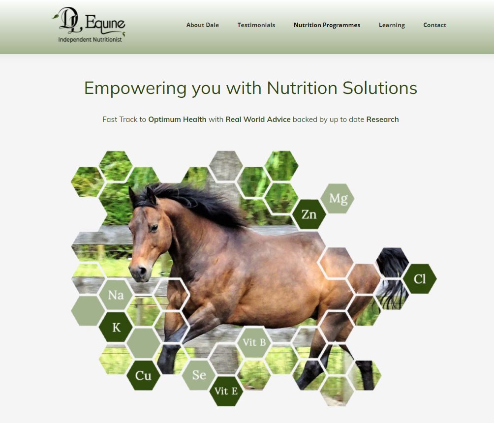
Industry: Horse Nutrition
Objective: Rebuild with a facelift. Displaying extensive content in a way that clearly communicated the offering and engaged visitors to seek more information.
profile-pic

Made it sound better and look professional

Dale Logan , Owner of DL Equine

Suze drew the info out and made it sound better and look professional.

I used to spend soo much precious time on my website, it was cluncky to use and just didn’t look professional. I was so frustrated, wasting time and ending up just making a mess!

Then I discovered Suze of Upsurge, where I had developed the website of my dreams!

Suze really is the guru of all website and IT!

Suze has the amazing ability to really listen to what a client wants to achieve and to pull all those ideas that are jumbled in your head into fabulous imagery and writing.

I can’t recommend Suze and upsurge enough! Get your professional website developed by Suze from Upsurge, you won’t be disappointed!

Visitor Interface & Experience

(the pretty bits and strategy behind them)

Before

Text heavy site with PayPal payment gateway and extensive blog posts.

Site that would benefit from a visual hierarchy and imagery to communicate authority

After

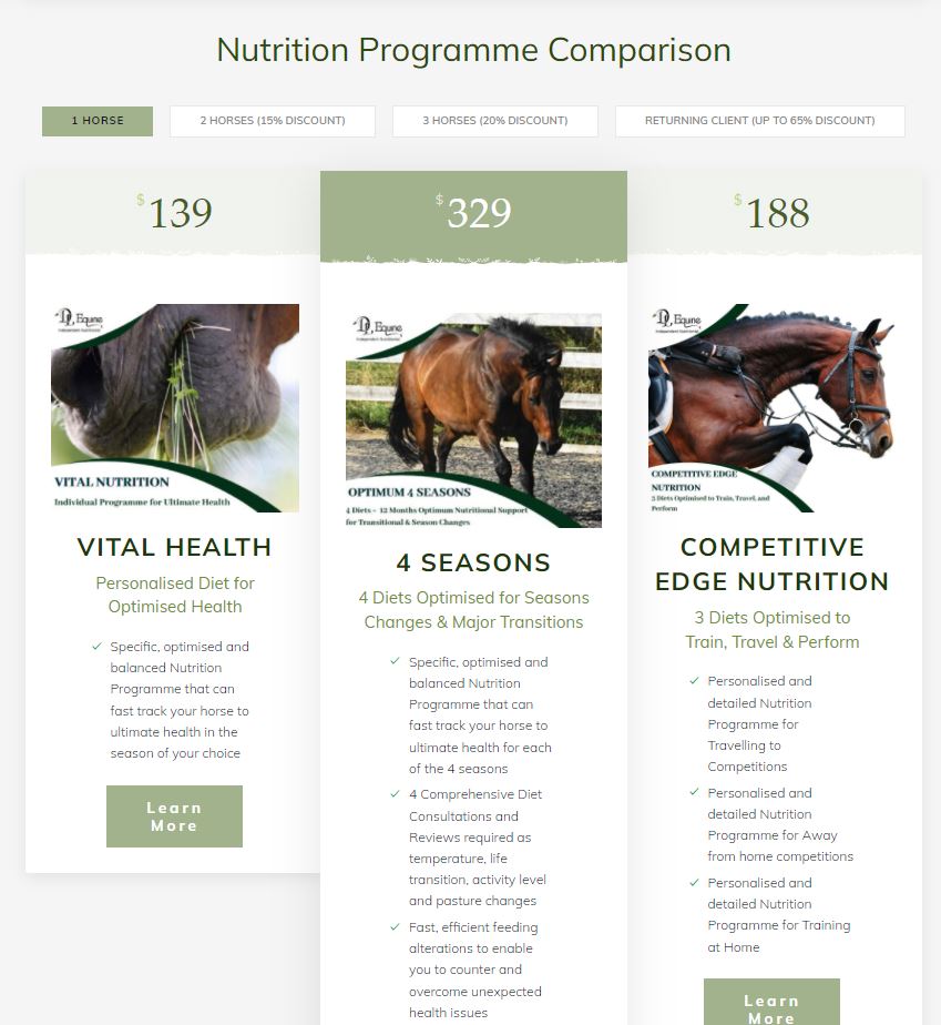
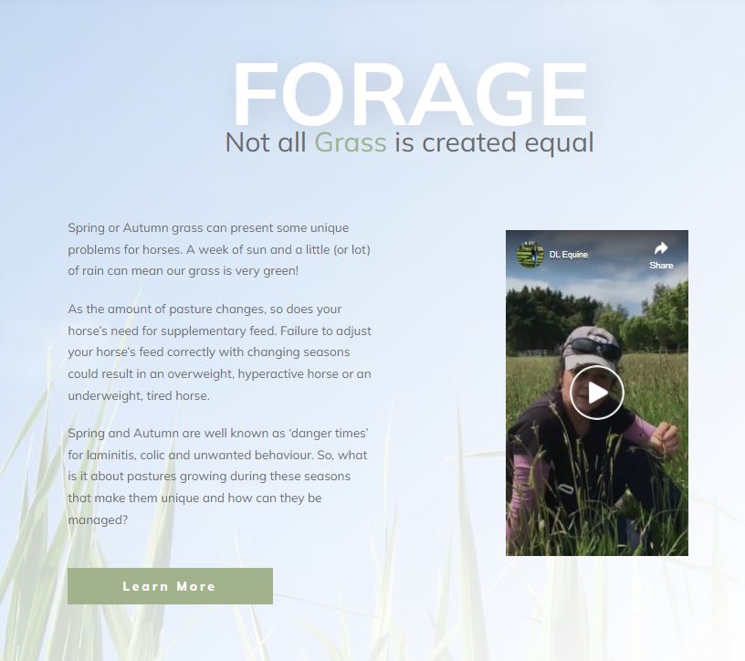
Redesigned navigation & look and feel. New imagery, product comparison table, blog layout & user experience.

Hero image on homepage to communicate science training and love of horses

Pricing table that allows quick comparison and informs visitor about the range of services

Authority building highlighting experience and education

Infrastructure

(the hidden techy bits that make it all work)

Before

The site was difficult to update using native WordPress editor.

After

Thrive Content Builder allows Dale to make quick changes with it's 'what you see is what you get' interface.

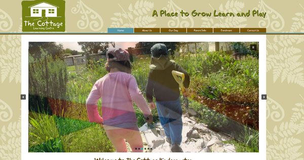
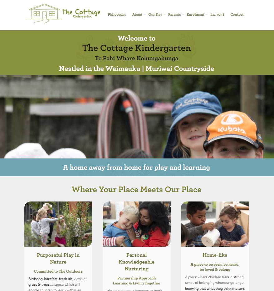
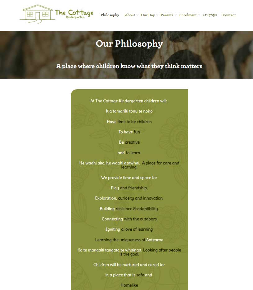
Industry: Early Childhood Education
Objective: Update site to communicate the values that make this kindy so special

Visitor Interface & Experience

Before

Simple site that wasn't maximising the opportunity to communicate the special people and environment

After

Redesigned navigation & look and feel & user experience. Commissioned a photographer to capture the essence of this beautiful place

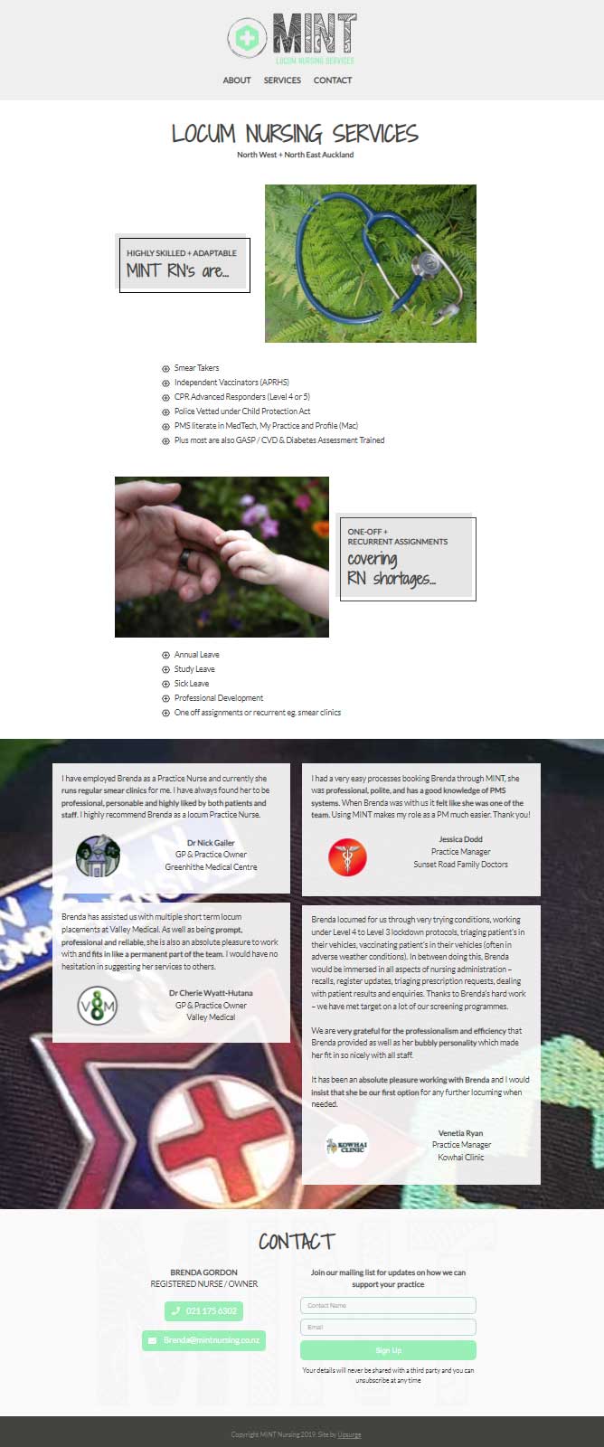
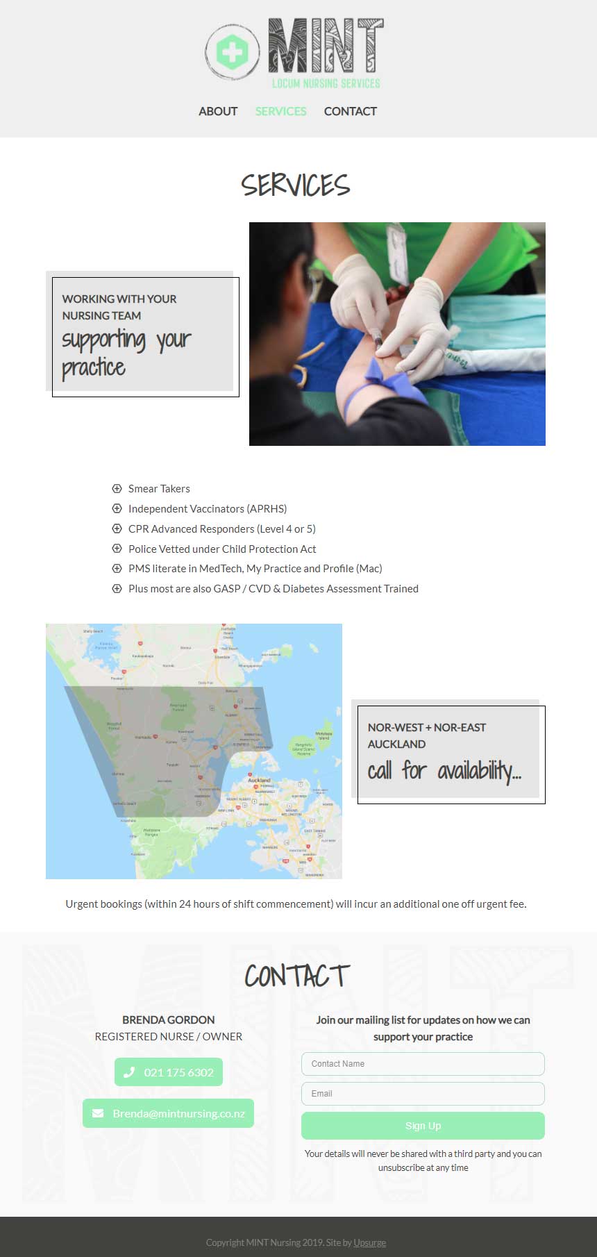
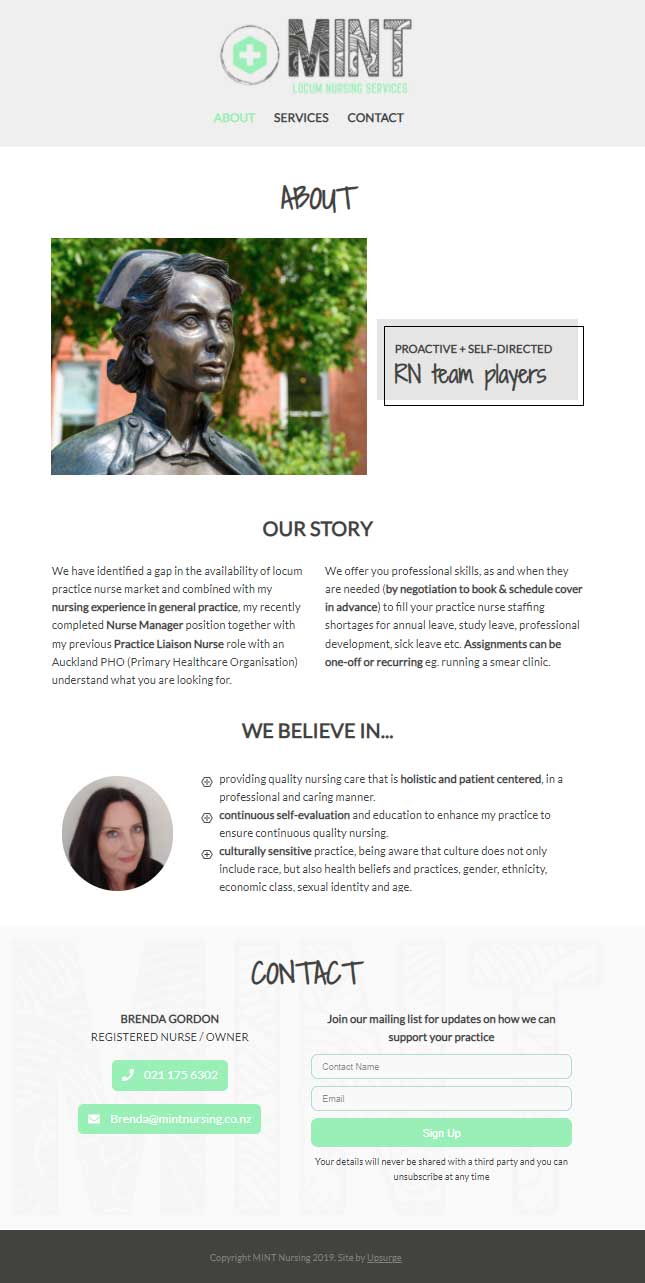
Industry: Locum Nursing
Objective: New site to explain services clearly and provide a way to contact
profile-pic

For a techno phob you have made this daunting process a dream

Thanks so much for your amazing services!!

Visitor Interface & Experience

Clean site with lots of white space highlighting owners expertise and work ethic.

Showcasing testimonials on the home page

Clear communication of skills and locations covered

Clean design and invitation to contact

Industry: Industrial Components
Objective: Rebuild with a facelift that highlights product range and services. Make it easy to update.

Visitor Interface & Experience

Before

Simple site that wasn't maximising the opportunity to communicate their extensive range of products and services.

Site that would benefit from a visual hierarchy and imagery to communicate authority

After

Redesigned navigation & look and feel & user experience.

Clear imagery and detailed footer to ensure product range is visible on all pages

Clear product range and benefits

Infrastructure

Before

The site time consuming to update.

After

Thrive Content Builder allows Mark to make quick changes with it's 'what you see is what you get' interface.

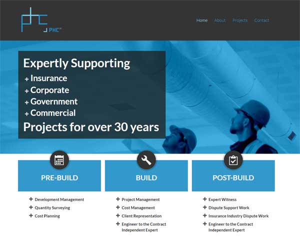
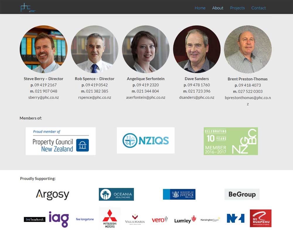
Industry: Quantity Surveying
Objective: Rebuild from scratch a site that was past it's use by date - new logo, new design, new visitor experience. New host too.
profile-pic

Upsurge interpreted our ideas and our image requirements perfectly

Objectives: To update a very dated and cumbersome site. Yes, these objectives were met.

Very easy to work with. Upsurge took our rough ideas of what we wanted to achieve and very quickly produced a site we liked. We are very happy with the design. Upsurge interpreted our ideas and our image requirements perfectly.

Technical know how was greatly superior to our previous provider. We were very happy with what we got for our money. We think we got very good value.

Definitely recommend!

Visitor Interface & Experience

Before

The logo & site were shining examples of 80's design that didn't reflect the company's current ethos of modern, agile and punching above it's weight.

After

1st step - new logo (n8creative.co.nz). The shapes and colours of the logo then informed the site design. Completely redesigned navigation & look and feel. New images, copy and iconography (funky little pictures than help communicate the core messages).

Home page that communicates what they do and why they do it better than competitors

About page that showcases the team - the most important component in a service business

Gallery featuring their best work

Infrastructure

Before

The site was difficult to update and expensive to host. No https so Google was penalising it in search results and bring up warnings about insecure content.

After

Thrive Content Builder allows Rob & Steve to make changes themselves, hosting is less than a coffee a month (yep a month) and google is now happy with https in place. Also added Wordfence to ensure the hackers couldn't reek havoc.

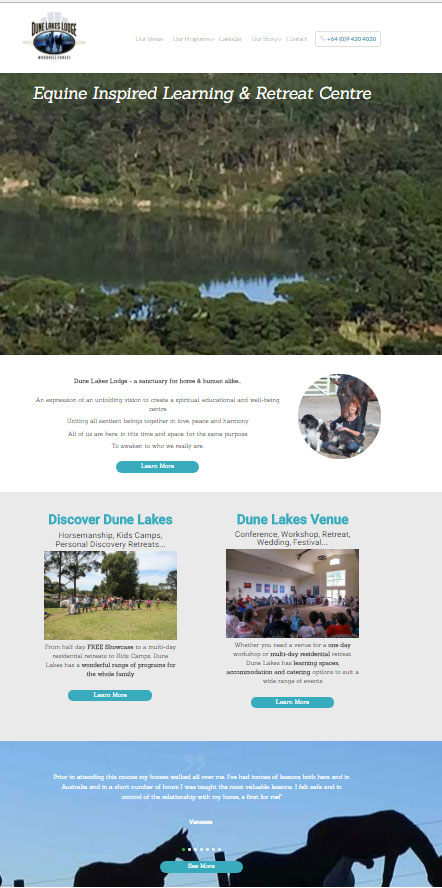
Industry: Venue
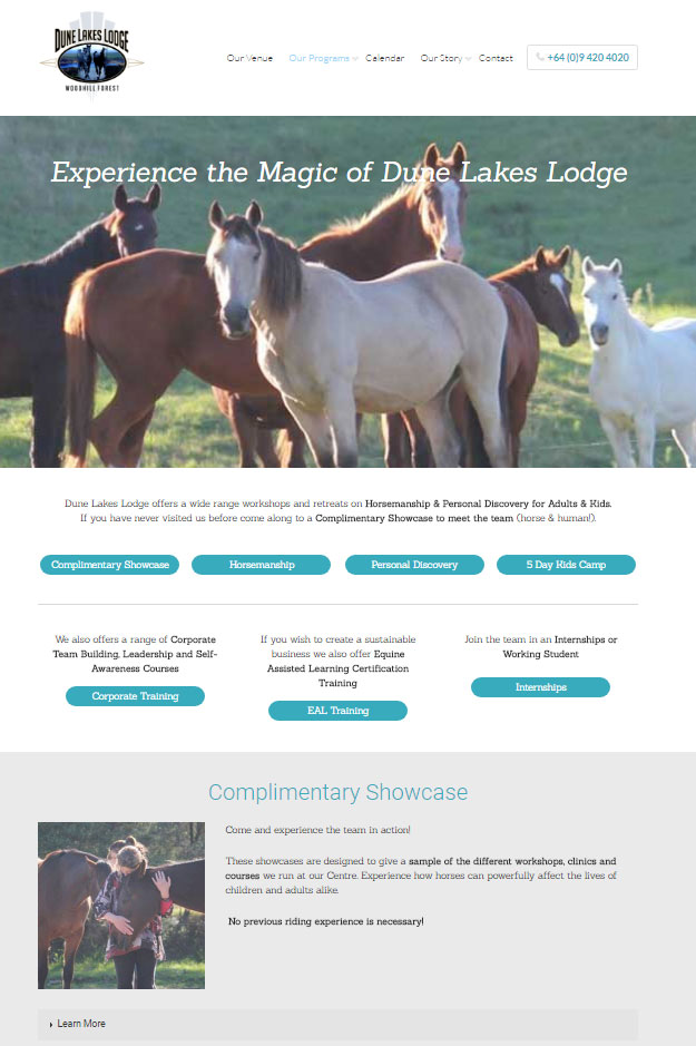
Objective: Rebuild from scratch a site that had grown organically over a long period and had become challenging for the user to find the offerings of Dune Lakes and the site was not mobile friendly. New host too.
profile-pic

An extremely professional service

Rosemary Wyndham-Jones , Director

Objectives: to get a new website up and running asap.

Easy to work with, very helpful and clearly understood what we wanted. Design wise the site is crisp, clear and works on multiple devices. You certainly have the know-how and can do attitude and Horseome value for money! Definitely recommend - an extremely professional service.

Visitor Interface & Experience

Before

The visitor experience was suffering from the site growing organically over a number of years.

The site had become very full of information that needed regrouping and pruning,. Also not mobile responsive

After

It was time to make life easy for the visitor with clear choices and simple navigation. Brainstorming at the strategy and planning stage meant it was simple to find what you needed and showcase the beautiful location and inhabitants.

Extended homepage that acts as a 'taster' for all other parts of the site. Providing social proof via testimonials & inspirational photos

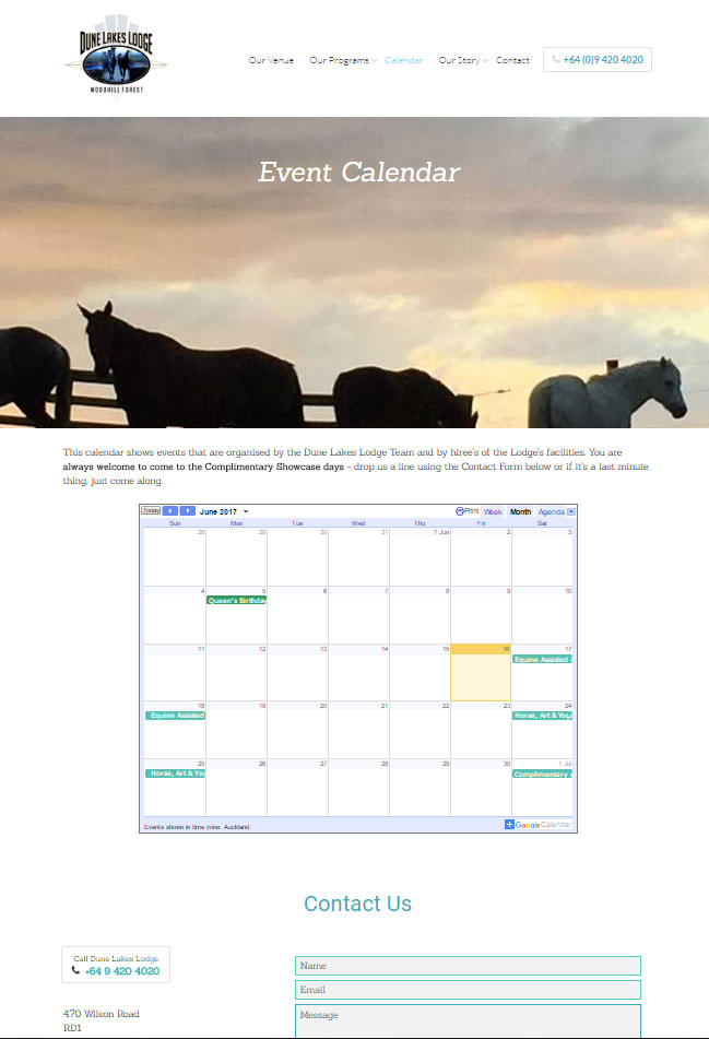
Online calendar linked to Google making life easier for everyone

The range of programs all on one page with internal navigation means it easy to find what you want and learn about what's on offer

Infrastructure

Before

The site was not mobile responsive and was slow to load. The hosting was expensive and there was no https to please google.

After

Thrive Content Builder means Rosemary can update all the pages herself quickly and confidently. Google is now happy with https in place. Also added Wordfence to keep automated attacks under control (hacking is not personal - it's opportunist).

Industry: Corporate Wellness Coaching
Objective: Recreate a site that was already live in Wix maintaing user interface (flash way of saying design) and user experience (flash way of saying functionality, pages and menu structure)
profile-pic

Great communicator throughout the process and very knowledgeable in this space

Jo van der Walle , Director

Suze at Upsurge recently helped me recreate my website on wordpress and I couldn’t recommend her more. She was a great communicator throughout the process and very knowledgeable in this space. She was always available to answer questions over the phone, meet in person and very punctual and reliable with the deadlines given.

Not only did she create an outstanding result she was also able to provide great recommendations along the way and always happy to step outside the brief to make sure my website that bit better.

After outsourcing my website to consultants in other countries – that seemed to have a cheaper hourly rate – the lack of understanding and slow results frustrated me and in the end it would have been much more effective and efficient to use Suze from the get go.

Visitor Interface & Experience

Before & After

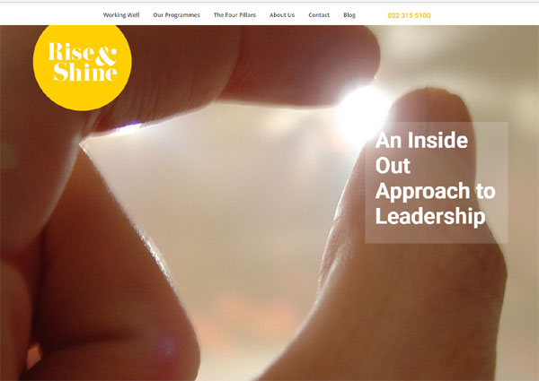
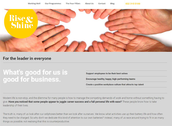
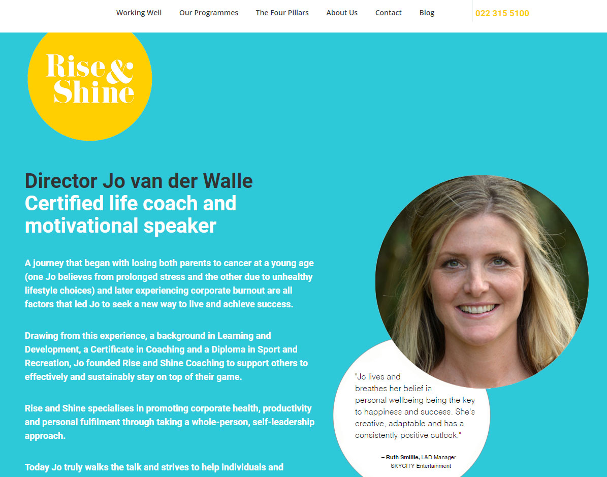
Exactly the same - kind of like re-piling your house - improves your foundation for the future but it's invisible....

Beautiful homepage

Good use of imagery to create intrigue and communicate the values of Rise and Shine Coaching

Jo's site uses colour beautifully with complimentary yet bold choices

Infrastructure

Before

The site was build using Wix.com which meant google was not happy (no https) and it took quite a bit of extra time to get it looking good on mobile.

After

Thrive Content Builder means Jo can easily update the pages and create good looking blog posts to keep visitors coming back. Again https and Wordfence ensure the site ranks well in searches and is secure.

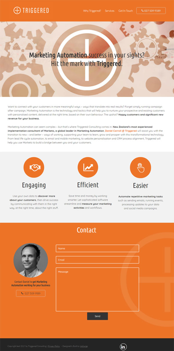
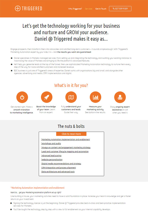
Industry: Marketing Services
Objective: Create a site based on a logo, colour pallet and fonts provided by a designer to act as an online business card/brochure
profile-pic

Really happy with final result

Daniel Carroll , Director

Objectives: Support my business, all objectives met, yes, really happy with final result.

Very easy to work with, very responsive, you know your stuff :). The design worked great, very on brand, couldn't be happier. Didn't do copywriting for my site, but helped in some areas with this, which was great as my copywriter isn't a specialist in my area of business or in website copy.

Very good value for money and absolutely recommend UpSurge.

Visitor Interface & Experience

Before & After

There was no before and only an after... He did already have a logo, colour pallet and preferred fonts which helped in designing the site. Daniel included a handy 'Click to Call' feature in the header (bit at the top with the page names) so mobile visitors can just click to button to get through to his mobile.

Homepage features a bespoke header image created specifically for Daniel's brand. It also uses icons to break up text and give a cleaer and multiple contact methods including social media

The services page also uses icons and internal navigation to make sure the visitor has easy access to FAQs

Infrastructure

Before

We used Daniel's existing host (where he had been storing his emails @triggered.co.nz).

After

Thrive Content Builder means Daniel make great blog posts in the future and update the site where needed. It's secure and searchable and the traffic is tracked through Google Analytics.

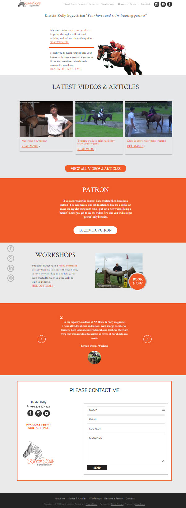
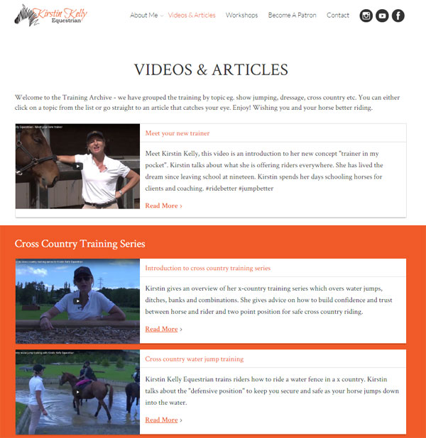
Industry: Equestrian Coaching
Objective: Create a site that allowed Kirstin to provide online education and passive income. Funding uses the crowd sourcing model using a patron approach with Patreon. Video's are hosted with Youtube. Site is fully mobile responsive and looks gorgeous due to the design of Cherie at ferndesign.co.nz
profile-pic

Upsurge has been brilliant setting me up to update my website by myself

Objectives: Having a website that was easy to use, fast and responsive were my main priorities. Suze from Upsurge has developed a website for me that is all that and more.

Upsurge was great to work with, they got it done on time, they gave me some great ideas and came back to me quickly.

As I am fairly green when it comes to the technical side I was impressed how Suze talked me through how it would fit together, she came up with solutions to a couple of problems and has been brilliant setting me up to update my website by myself.

Upsurge was great value for money. I would thoroughly recommend Upsurge to my friends and colleagues.

Visitor Interface & Experience

Before & After

There was no before and only an after... Kirstin already had logo and Cherie from ferndesign.co.nz created the look and feel for the site.

Clean, easy to navigate design with social proof (testimonials) to build credibility, multiple contact method and encouraging social sharing

Clean, easy to navigate design with social proof (testimonials) to build credibility, multiple contact method and encouraging social sharing

Blog grid that allows grouping of blog posts into training series

Blog grid that allows grouping of blog posts into training series

Infrastructure

Before & After

Thrive Content Builder means Kirstin is self-sufficient - uploading videos and embedding them in vlog posts. It's secure with Wordfence keeping hackers and spam at bay, optimised for SEO and the traffic is tracked through Google Analytics.

Not local? Not a problem. I will never meet many clients face to face - there are great virtual meeting services ie. skype and zoom

Contact Suze to discuss your online project